
“Bubble or not?” – this question is getting more crucial while the market continues its rally.
Stocks have become expensive, but the market seems to be strong. There are many investors who want to keep playing long: “trend is my friend”. This is right in most cases. Moreover, in real life staying away from the market while it is flying away is not possible for extended periods. It is the nature of the market that we are always afraid of something – both high valuations and low valuations.
Valuations must be strategically accounted for, though. Having high risk portfolio at hot market results in losing principal. In other words, aggressiveness should depend on the market condition. This literally means that the risk should be decreased when the market is overvalued and increased at the opposite case.
Is the market overvalued or not? Where are major risks are? How should investor be positioned to protect himself? This review is an attempt to analyze these questions.
Market Valuations
______________________________
Chart 1 shows relative valuation of the IT sector in the US. I believe it is the most interesting case as IT was in the centre of “.com” bubble. The average “price to sales” valuation of the IT sector reached 7 in 1H 2000. In February 2021, IT repeated its record high.
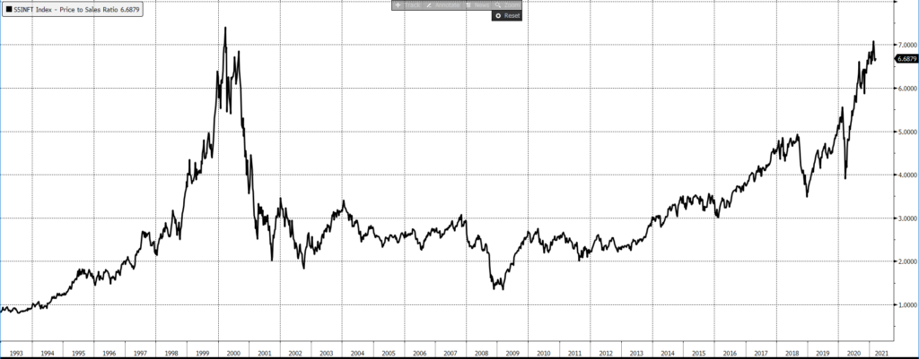
One can take other indicators such as “price to book value” and the picture will be the same. Market trends in 2000 resemble current situation. Investor understood the great potential of IT companies and – this is important – they were right.
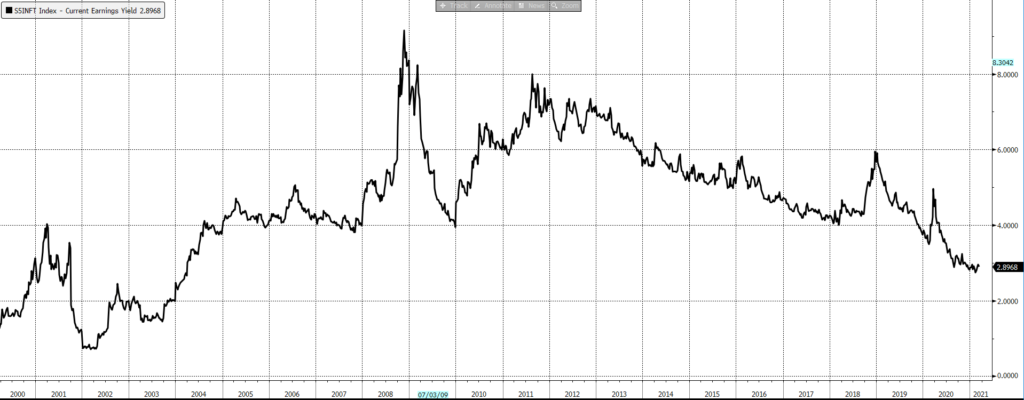
Chart 2 displays the current yield of the IT sector stocks – this is net income as a share of market capitalization. In other words, this is how much the investor will get long-term had a company (or a sector, or index) stabilized at a given level of revenues. Investors were ready to buy IT at 1.5% of current yield because they expected the sector to grow exponentially.
Typical current yield of mature company or sector has been circa 5—6% pa.
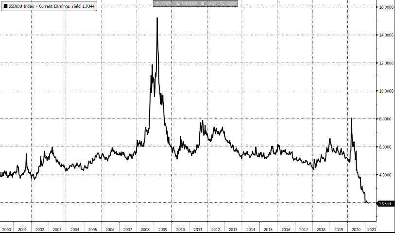
For the comparison, Chart 3 shows the current yield of Industrial stocks in US[1].
So, buying IT stocks, an investor paid premium for x3—x4 times growth. Buying stocks today, an investor also pays this extra premium. The flipside is that in case the market cools off the investor will be waiting for a recovery for years.
Let us conduct a thought experiment: let us go back to early 2000 and put ourselves into a place of a dot.com investor.
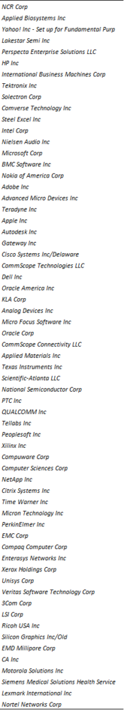
The IT sub-index was based on 63 stocks, they are listed below.
First thing to be noted: 37 from 63 stock names were acquired, most of them in 2013—2018. It was primarily due to poor performance of these companies. The acquisition price of only 3 from 37 companies was higher than that in 2000. These are loss-making positions.
17 from 26 companies that survived are being traded on higher levels than in 2000.
Total success score in case an investor buys the IT index in 2000 is 32%. However, these companies paid off. Had the investor started with $1mio, he would have ended up with $3.8mio portfolio as of 8-March-2021.
It is an intriguing fact that $2.8mio profit is contributed by only four companies! These are:
- Adobe
- AMD
- Apple
- Autodesk
(I am not sure that it matters anything that all these companies start with “A” letter).
The major profit contributor is Apple – $1.8mio. Had the investor decided not to buy it or to sell it too early, the result would have been different. This is all about stock-picking importance, as well as about the cost of a mistake in stock allocation.
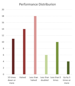
Chart 4. S&P 500 IT sub-index 2000-2021 performance distribution by company
(Bloomberg)High-level stock selection was also possible to a certain extent.Let us be honest with ourselves – it was quite hard to predict the Apple’s triumph in 2000. It was years before iPod, iPad and iPhone invention. Our analytical power in predicting each company’s future is not nil, but limited. To avoid mistakes, an investor should bet on a sector. Chart 4 shows future performance of companies included into the index. Most likely a stock is a bit lower than it was in 2000: 18 from 63 companies are down less than by 50%. Prices of 11 companies have fallen close to zero. Overall positive performance is contributed by 10 companies which have grown more than twice and four companies which are now more than five times more expensive than they were in 2000.
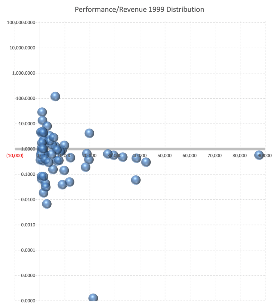
With the benefit of hindsight, we can notice that purchasing large companies with the top line above $10bn are loss-making except one case with 1999 sales near $20bn. It is Microsoft.Chart 5 shows the dependence of 20 years performance on companies’ top line in 1999. More simply – on companies’ size. Companies above horizontal grey line are higher than in 2000, below – lower.
Had an investor stayed away from 22% of companies with the largest 1999 top line, he would have improved his performance by 28%. Had that money been invested in US Treasuries or Gold, it would have been even better.
Therefore – stay away from large names.
Chart 6 shows the performance of companies against their Price-to-Sales valuation as of 2000.
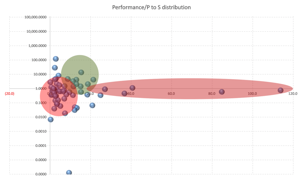
Cheap companies with P/S less than 10 tend to have negative performance as well. The best valuation range for investing was 10—20. However, a deeper look allows to discover that the major contribution in terms of money has been made by companies valued at 2—4 P/S ratio. Therefore, such companies cannot be ignored.What we can observe on this chart is that the companies with P/S more than 20 happened to have at least poor or, more likely, negative performance.
Combining two previous observations we can come to a conclusion: to increase profitability, we should avoid large and most expensive companies.
Large companies are easier to invest – they are well-known and better analyzed. But the potential for expansion is limited, so that an investor cannot get a significant upside there.
Expensive companies are all growing, they have great expansion potential, but inflated price makes it hard to get profits there.
All above is not about IT, it is about general approach to investing in bubble-time. The market is overheated – this is the fact. So, one should think twice buying Tesla (which is a large and expensive company), Microsoft or Apple – they are too large to have a great potential. 18 from 48 companies from ARK innovations ETF have P/S ratio well above 20. Looking at IT sector as of 2000 helps us with understanding where we are now.
Where are we now?
______________________________
In various periods of time investors prefer either stable, mature companies (which we call “Value stocks”) or risky, but promising growing companies – “Growth stocks”. The ratio (Value/Growth) shows what the investors’ attention is focused on.
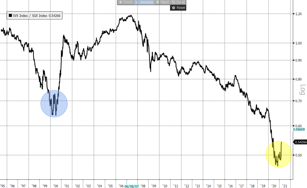
It is reasonably clear that the appetite to growth increases when everything else very expensive. Dot.com rally in 1998-2000 represented the finish point of a long twenty-year equity market uptrend. For an investor it was difficult to force himself to buy low-return instrument. However, it can easily be done with growing stock. In this case a “typical investor” can convince himself that high P/S or P/E does not mean anything as future growth will compensate low current yield. After such an idea becomes evident to everyone, it results into mass hysteria, when investors buy stocks just because they are going up. This is what happened in 1998-2000. The Chart 7 shows “Value” stocks with respect to “Growth” stocks. Value stocks were rapidly losing their value.
In 2000 this trend came to an end and reversed. This is exactly what is happening now. There are several common features with 2000 and 2020:
- In both cases there was a serious turbulence in the midpoint of value rally. Twenty years ago, it was an Asian and Russian financial crisis in 1998. Now we have coronavirus.
- Both times “Value” devalued by circa 30% respecting to Growth.
- In both cases there had been sustainable long-term uptrend which was transformed into a Value rally.
Looking at a strong Value/Growth recovery in 2000, we should ask ourselves: “Isn’t a current Value recovery just a beginning of its way up?”. Well, no one can say that for sure, however it describes existing risks. Let us take a deeper look and see what happened in 2000 with Value and Growth.
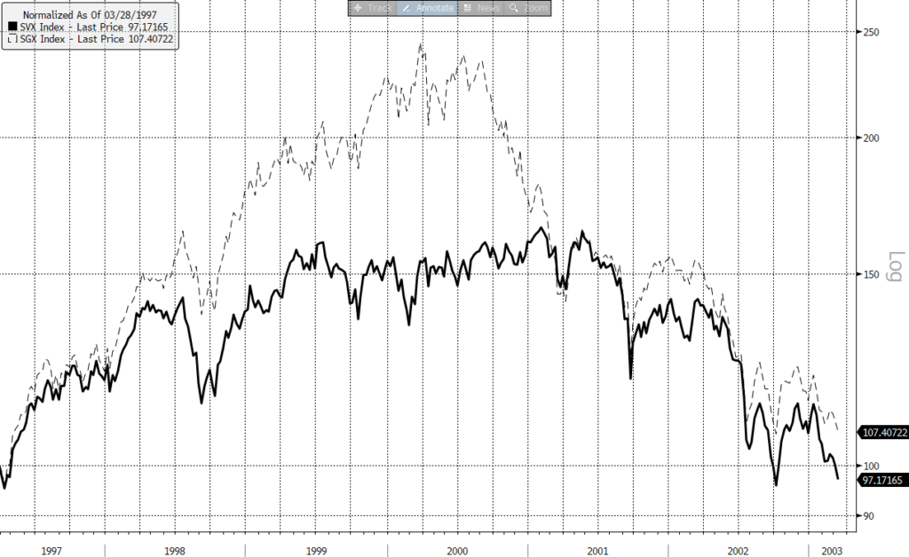
It is worth comparing 1999 with the end of 2020 and the first two months of 2021: after Value has grown, Growth stocks quickly caught up with some segments such as Innovation, Biotech, 3D Printing being up by two-three times on huge inflows from private investors. It is interesting that in 2000 it took a year (from June 2000 to July 2001) for Growth stocks to erase their previous catchup. They did not stop at they point, though, and, starting the second half of 2001 both Value and Growth continued its way down.
Chart 7 shows us that we are somewhere in the middle of 2000 – projecting 2000 situation to 2021. From this point Value stocks still had a limited upside in 2000, while for Growth it was the very beginning of a long trip down.
It should be stressed out that the downtrend in 2000 started with a significant correction in the beginning of Q2. This correction was as strong as in 1998 on Asian crisis. Current correction is also as big as it was in 2020 with Innovation stocks (ARK innovation ETF) or Biotech.
There was a recovery in 2000 as well, though. Those who wanted to quit the market, had six months for that.
To sum up, there are several similarities between the market condition in 2000 and 2021, so that it can lead to a serious downtrend:
- Rally in growth stocks,
- Long-term equity market uptrend preceding this rally,
- Following stabilization and recovery of Value/Growth ratio
- Significant correction in Growth with stability in Value segment
- Relative valuations of growing stocks
This time will be different.
______________________________
Of course, patterns never repeat exactly. Current market behavior can be characterized by two major differentiating features:
- Much more noticeable role of non-qualified individuals,
- Unprecedented amount of printed money
Influence of individuals
This type of influence is connected to the lack of investment opportunities for individuals. Previously, there were two major ways of saving money:
- Bank deposit
- Asset Management services
Nowadays banks offer too low rates to attract clients. People have an easy access to numerous ETFs and simplified electronic access to secondary trades, which allows to overcome professional Asset Managers. Now clients themselves are responsible for the sector allocation. Psychologically, individuals are inclined to focus their attention on the hottest and most growing segments, ignoring low yields. Sometimes it results in price surge when the liquidity of ETFs is not sufficient. For instance, the inflow into 3D-Prnting companies ARK ETF within the first week of February 2021 was larger than the cumulating inflow since inception of this ETF in March 2020. ETF spiked by 25% on that. After the inflow decreased, ETF’s price went down by 30%.
Individuals’ savings are on a high level after stimulus from the Central Banks. Combination of huge savings, low banking rates and easiness of market access pushes individuals into equity market.
Influence of money
Large emission makes the situation even more complicated.
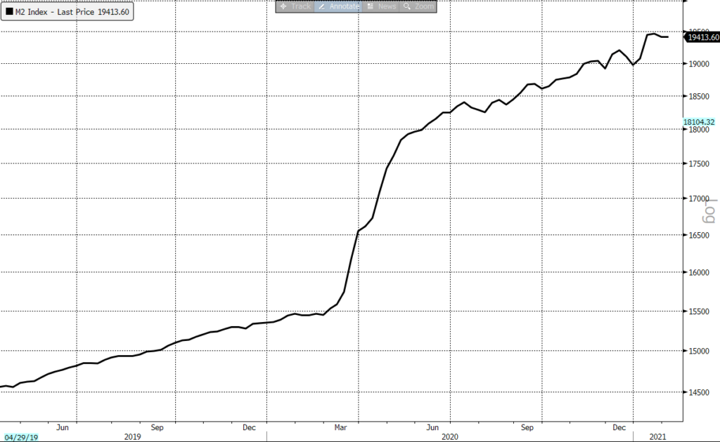
The scale of US stimulus is impressing. It is essential to understand that the previous QE programs did not lead to M2 (money in circulation) increase. That money was injected into the banking system. Banks needed to enhance lending to increase M2. That did not happen.
Now money is injected directly to ultimate consumers. Theoretically four printed billion (!) can cause 25% inflation, which would be catastrophic for the economy. This is not just a theoretical fear: US bond market has already significantly dropped on that. Inflation expectation with commodity market have spiked.
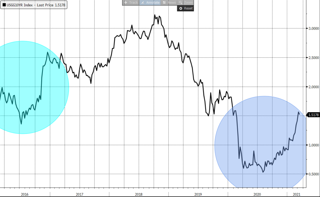
What has recently happened in bond market resembles the 2016 pattern. In 2016 Fed was planning to start increasing the Fed Rate. That pushed both equity and bond markets down. The inflation itself is neutral or even positive for markets. By contrary, fighting inflation is always bad, would it be the base rate hike or fiscal measures implementing. The same statement is fair for today. “Someone is not right here”. Why do inflation fears affect the bond market and almost completely ignore the stock market?
I believe, the reason is that non-professional investors get the printed money and focused on stocks, while professional investors (banks and funds) are much more concentrated on bonds. Rate hike in 2016 did not come with the emission. Therefore, the only difference between 2016 and 2021 is less individuals’ savings in 2016.
The only outcome from this is that the inflation risk is not priced in in stock market: so far equity investors are only seeing positive inflation influence.
Besides the inflation factor, a potential US tax hike may (or definitely shall?) also hit equity markets (being positive for bonds, though). Raising the corporate tax rate to 28% from 21% is under consideration. It will dent stock valuations, although it will not change cases fundamentally. Raising the income tax on individuals earning more than $400’000, expanding the estate taxes and increasing capital-gains tax are more substantial. The general idea is that the economy will pay for stimulus. The total price for the economy rescue is estimated up to $4 trillion over a decade. The more realistic rescue price is $1 trillion. However, which is more important, investors’ common perception is that the market is growing while money is being printed. After the emission factor is gone, something new should be made up for supporting buyers’ optimism.
Summary
______________________________
Current market situation bears numerous sigs of last stage of bubble:
- There are lots of reasons to assume that technically now the markets are repeating 2000 Dot.Com pattern.
- The valuations have reached their top levels, prices already started to go down.
- Only most overpriced stocks are falling now with the rest market to be resilient. It is typical of the first stage of the downtrend, like it was in 2000.
- Projecting 2000 pattern on current situation means involvement of more stable value stocks into downtrend.
- Monetary emission might support markets. The cost of emission is inflation, which is a potential threat in case the authorities begin to fight it. This risk is partly priced in in bond market, but not priced in in equity market.
- Increased role of individuals might result in abrupt market crash in case the market turns down.
- Protecting equity portfolio is possible through avoiding leveraged equity position, investing the part of the portfolio in short-term bonds, and avoiding large and highly valued companies.
The market never repeats patterns completely – every time we observe something new. It is still possible that markets will go far up, the emission will support equities limiting corrections with the inflation risk being managed by Fed somehow. However, risks have gone up as well, so that they can no longer be ignored.
[1] The fall of Industrial Sector current yield in 2020 is a result of profits contraction, not price rise