Inflation has been considered a major factor affecting all markets this year. It seems likely will keep being protagonist of the investors’ play in months to come. There is still no consensus on the matter, future inflation picture is extremely blurry. The only thing we can tell for sure — the risk of inflation will persist in the foreseeable future. There are too many myths and too little information about the inflation phenomena, though. This review is based on the practical approach to this matter from the point of view of a portfolio manager.
Intro
There are two bad things in the market – deflation and accelerated inflation. This is the common perception of investors. The most comfortable situation is moderate inflation. Economy shocks lead to significant swings in prices which kicks monetary systems out of the comfortable zone for investors. Printing money, which has been a favorite tool for dealing with crises, also create significant inflation risks.
The Federal Reserve System managers, like all other managers in central banks, watch the real rates, which reflect the excess of loan rates level above current inflation. Sustainable negative real rates can cause the so-called inflation spiral. This is dangerous and can result in, in turn, to hyper-inflation. To avoid that the central banks raise interest rates.
Raising rates affect all aspects of economic activity. The most direct impact is on the bond market, its nature is obvious.
The influence on the stock market is more complicated.
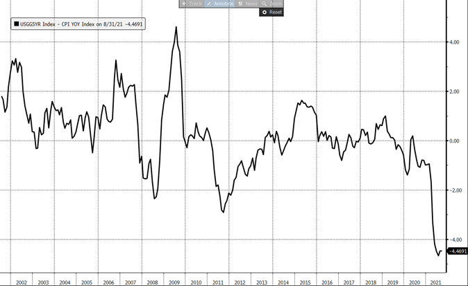
Inflation fears dramatically surged in February—March 2021. Figure 2 shows the impact of it on the bond market. S&P 500 index was not touched by this move at all. However, developing fast growing companies very much felt these fears. Tesla stocks fell 40% from its historical high of $900. This correlates with the US bonds’ behavior. Tesla is just a bright example of a much broader class of developing companies which are very far from their net income breakeven so far. These are mostly innovative companies in IT, AI, biotech, and similar sectors.
The most popular explanation is taken from the Discounted Cashflow model. The stock price is a sum of discounted cashflow provided by the firm. Stable mature companies are like short-term bonds – their cashflow is concentrated in the nearest future. New fast-growing companies are like long-term bonds – they start providing material cashflow in many years on. Long bonds are much more sensitive to the interest rate than the short-term ones. The same statement is true in respect to fast-growing companies.
There is one flaw with this logic, though. Inflation increases the expected cashflow too. Theoretically cashflow increases proportionally to the inflation rate – as well as the discount rate. Thus, theoretical stock price does not depend on the inflation and rates increase expectations.
However, in practice it is not the case.
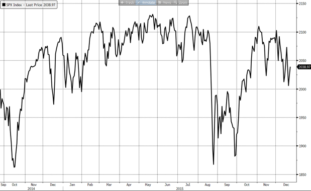
Figure 3 shows the dynamics of US stocks in 2015, when Fed started signaling about possible rate hike. This spoiled the long-term equity market uptrend, turning 2015 into one of the less profitable years for investors.
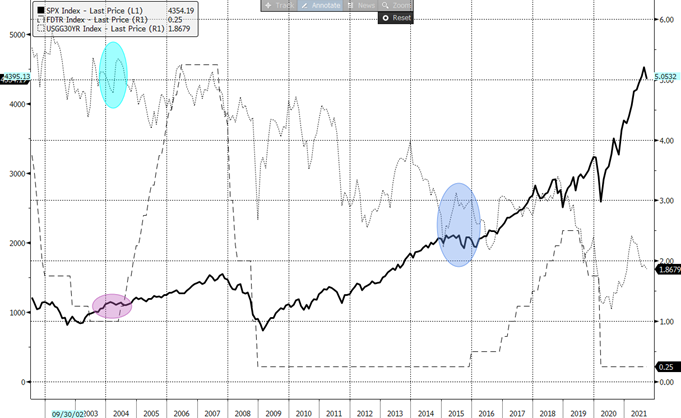
Figure 4 displays the large-scale picture. One can see two moments when the US Federal Reserve started rising the base rate – in 2004 and 2015. The dotted line is the yield of 30Y US Treasury bonds. This is the best indicator of the interest rates expectations. It is not a surprise that the 30Y UST yield had surged before the rate hike decisions – this is highlighted with two vertical ovals on the Figure 4. Bold line gives us understanding of equity investors’ mood. Both respective periods were characterized with the lack of dynamics. In 2015 it came along with quite serious equity market correction (Figure 3).
So, what has happened so far? Have investors priced in the future inflation or not? Crash of the bond market in March tells us that they have. Growing tech stocks tell us the same. But the broad market (S&P 500 index) has not noticed inflation fears.
In our view, inflation story is anything but rationalization of the market behavior. The bond market and tech stocks corrected in March because they both had become incredibly expensive after the impressive rally in the end of 2020. It is often that expensive assets correct. Moreover, when investors start selling overvalued securities it generally concerns all possible markets. This is the nature of correlation in financial markets.
Along with that, IT giants such as Microsoft, Apple, Facebook – they all managed to ramp up their earnings, which made their valuations justified. This is the reason of steady behavior of S&P 500, where IT giants represent large share of the index. Another large part of US stock market are stable and mature companies such as Walmart, CISCO, Verizon etc. was not touched by the coronavirus hurricane. These stocks did not fall, did not recover and did not correct aftermath: their valuations were fairly justified as well.
So, what we have seen so far is more like a technical correction than the actual fear of inflation. Then the question appears: what caused US Treasury market crash in February-March 2021?
Firstly, one could notice the similarity between the US Treasury market patterns in 2009 and 2021. It is typical that when a crisis happens investors exaggerate the danger. Stocks crash on that; the bond yields do the same. As always when it comes clear that investors overreacted, all prices return to more “normal” levels. US Treasury market simply repeated its own pattern of 2009 when the rates went back to the precrisis level.
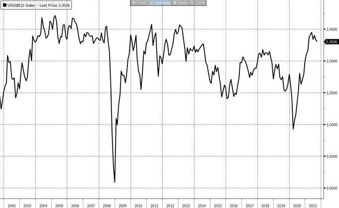
More illustrative chart is on Fig. 5. Thanks to the US inflation-linked bonds (TIPs) the inflation (CPI) can be traded. This chart is de-facto traded CPI for the next ten-year period. What happened to the inflation expectation was nothing more than a recovery up to its normal 2.5% level. The chain of events looks like that:
- Market crash plunges rates to bottom
- Fed prints fresh money to cope with the crisis. Inflation expectations appear
- Rates recover
Thus, the inflation fears have been entirely analytical. Some indicators point to potential issues with prices, but long-term inflation expectations have been within historical ranges so far. Moreover, a certain easing of the inflation fears is possible. Inflation, like any tradeable asset, follows basic technical analysis principles – the investors’ psychological patterns are the same everywhere. The first look to the Figure 5 tells that the expected inflation can fall a bit to 2.0 level or so (it is useful, by the way, to forget about all fundamentals for a moment and look at a bare technical picture).
So, the intermediate outcome is that almost everything that has happened in the market falls into general patterns not including inflation shocks. Fed insists that the inflation, if any, will be transitory. Does that mean that the danger does not exist?
It does not. The inflation game has not actually started yet.
Monetary mass and inflation
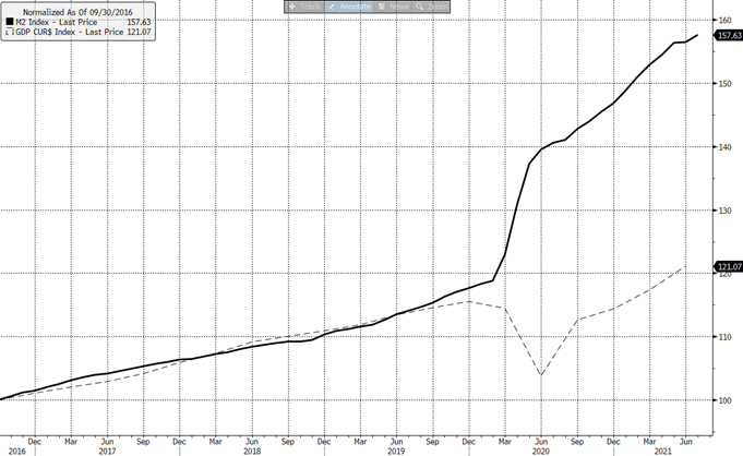
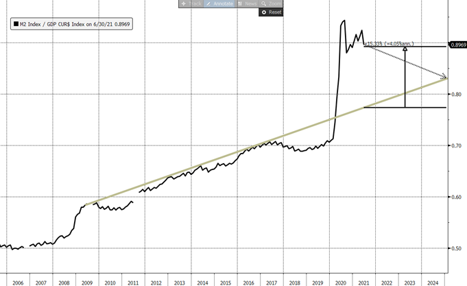
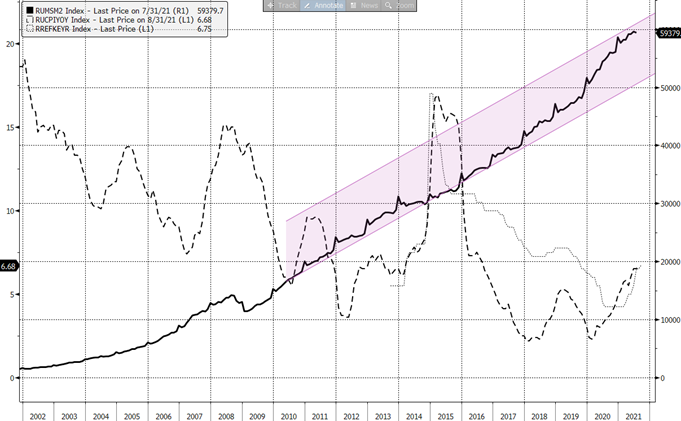
Figure 6 demonstrates the diversity between the US nominal domestic product and money in circulation (monetary M2 aggregate):
It is commonly understood that the amount of money needed for an economy is proportional to its GDP. It had been the case until 2020. Since then, though, M2 has outpaced GDP by 30% (Fig. 6).
The excess of money of 30% can end up with 30% prices hike. Are there mechanisms helping economy absorb this money without stress? The Fed claims there are.
One can notice that it had been until 2007 that M2 grew inline with GDP. In 2009 the first monetary rescue of the economy took place. It did not cause the outbreak of inflation. Furthermore, the growth rate of money in circulation had been consistently bigger than the GDP growth. As we already know, nor this factor neither several rounds of US/EU quantitative easing has not resulted in surge of prices.
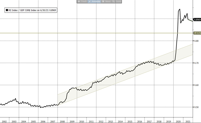
Figure 8 gives better picture of this phenomenon. The graph displays the ratio of M2 (money in circulation) to the nominal GDP in US. This shows peoples and companies’ accumulation behavior.
The more money individuals and companies want to have on their accounts the bigger this ratio is. This indicator has been gradually growing since 2008. With the economy slowing down and the rates with inflation being near zero, the cost of non-investing savings tends to reduce. That creates fantastic opportunity for central banks: money printed for rescuing economy can be largely absorbed without significant inflation risk. The question, however, emerges: where is the limitation for non-inflationary money printing?
The Figure 9 shows the way Fed possibly would like to see the future inflation track. Without excessive monetary stimuli M2 will grow slower than GDP, so the accumulation incentive will be falling, like it was in 2010 and 2017. This will lead M2/GDP ratio to is trend in three-four years. So, part of money can be taken out of the economy, the rest part will be absorbed by organically growing accumulation incentive (or falling money velocity, if you like).
More probable scenario is that we will see a flat M2/GDP ratio for the nearest several years: in the recent history there are no examples of serious money aggregates contraction. We assume it can be taken as a basic scenario. Neither Fed nor ECB will deflate monetary mass in fear of possible economic collapse. If so, by 2024 the M2/GDP ratio will still be above its upper trend bound. The excess will be limited, though – circa 7%.
Perhaps this 7% for the period 2022—2024 is a sheer transitory inflation of 2% annual rate Fed is talking about.
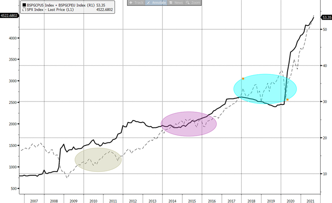
Figure 10 shows a combined, Fed and ECB balance sheet. Growing balance sheet means monetary stimulus or QE (quantitative easing): purchasing bonds, more specifically. Comparing Figures 9&10 one can notice that contraction of M2/GDP ratio is only possible after QE finishes. It does not necessarily work opposite: M2 was expanding in 2013—2014, when no QE was conducted.
Figure 10 also shows what happens to the American stock market after QE: these fragments are highlighted with the ovals. S&P 500 index turned into fluctuating mode with significant correction moves.
This is the outcome: transitory inflation is only possible in case the stimulus is over. The finish of stimulus, in turn, results into sporadic corrections – that is what the historic patterns show.
The major risk, however, is different: this is the inflation coming out of control. This can happen if prices go up stronger than it has been expected.
In this case the inflationary spiral may start to work:
- Population and corporates’ savings turn into increased demand
- This leads to corporate profits and wages growth, as well as the real estate market and commodity market growth
- This leads, in turn, to lending growth
- Growth of lending is a flipside of money in circulation growth. This is how M2 can increase without Fed – that opens doors for hyperinflation.
The only remedy against hyperinflation is a significant rate hike. That was US did in mid-seventies, Russia did in 2014, Turkey in 2018 etc. To avoid this scenario which sounds catastrophic, Fed should conduct highly balanced monetary policy.
Fed is constantly repeating its “transitory inflation” moto. One should bear in mind that “talking investors into” is one of the Fed’s instruments. Thousands of top managers are listening to Mr. Powell’s speech taking his words as a guidance for their firms’ price policies. Fed influences inflation expectations and uses this tool to retain prices. Although, history has numerous examples when this tool did not work out. A reasonable investor should take Fed’s words with a certain caution. Which means that the actual inflation risks are in black box. We just should bear this risk in mind.
Interestingly, for investing purposes the knowledge of the future inflation figures can be excessive. Inflation is bad, but fighting inflation is bad too. As we noticed before, it is sufficient to switch off the printing press to cause market corrections. Inflation scenario is much worse. That means, at least, that there are no reasons for being overloaded with risk now.
It would be worth noticing that any uptrend has inertia. It can be seen on Figure 10 – stocks do not stop right after monetary stimuli are over. This is not the sufficient ground for taking long, though. S&P 500 has risen much faster than it did in 2009 or 2013. This can signal that all positive factors are already priced in.
Why are central banks afraid of inflation?
Many think that it is central banks that print money. This is not correct: money is printed by banks. This is how it works:
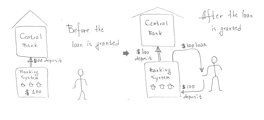
The point is all money banks lend return in a form of current accounts and deposits. So, giving money, banks do not lose it. They are just inflating their asset base.
What central banks can do is encourage or discourage banks, individuals, and companies to take loans or to redeem them:
- Raising the key rate (the rate at which the central bank provides loans to the banking system), central banks discourage individuals and companies to take loans. Banks’ assets deflate dragging M2 lower. Lowering the key rate works opposite.
- QE, which is purchasing assets (mostly bonds), encourage banks to provide loans. QE’s goal is to enrich banks with cash. This state of banks is commonly referred to as “liquidity surplus”.
Credit demand is a key factor for inflation. Negative real rates (when loans are cheaper than the inflation rate) create unique opportunities for business. For example, real estate developers are motivated to take loans – they are sure that their real estate objects’ price will grow fast enough to fully compensate the interest expense. The same logic can be applied to almost any business, as well as to private loans. This can lead to an exponential growth of banks’ assets and, hence, money in circulation.
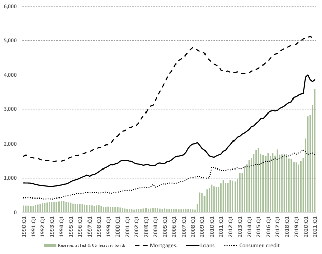
Figure 10a shows the dynamics of assets in US banking system. The surge of reserves reflects huge inflow of money, issued for rescuing the economy. Banks keep this money at Federal Reserve forming the banking system liquidity surplus. This happens when banks are suffering from the lack of credit demand. One can observe from the same figure that the asset base of US banks is not aggressively expanding with mortgages and consumer credit tending to shrink. This can change at any moment. Managing this process is the most important objective the Federal Reserve has.
Central banks’ tools for regulating M2 are limited. Tuning the key rate is the most important one. If inflation expectations appear to grow, central banks increase key rates to discourage from taking loans.
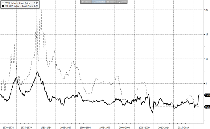
The first case when Fed used this mechanism happened in early seventies, after the cancellation of the gold standard. One can see two surges of inflation in 70-s and the Fed’s reaction in that (Fig. 11). From then on, this was repeated by many countries: Brazil in 2015, Russia in 2014 etc.
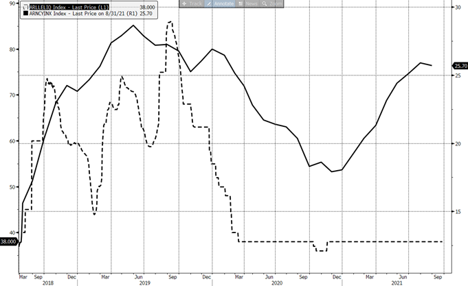
Ignoring inflation risk can be quite dangerous. The Argentinian Central bank started decreasing the key rate on the back of growing inflation. 2019 was a year of the presidential elections and the then-president Mauricio Macri insisted the key rate should be decreased to stimulate the economy growth.
The rate was decreased (Fig. 12), but the inflation kept growing, so the Central bank was forced to hike the rate even higher than before. Food prices in retail surged, so the Government decided to freeze food prices. That, in turn, led to the scarcity of food in stores. Macri’s rating dramatically fell and he lost the elections. New President, Alberto Fernandez, is a communist and lacks investors’ trust. In the end Argentinian Peso’s circulation was frozen, as well as hard currency deposits. In 2020 Argentina defaulted its debt. This is an example of how dramatic events can be in case of wrong monetary decisions.
Investors know that and follow all steps taken by central banks. In case the logic of a central bank is unclear investors cut risk.
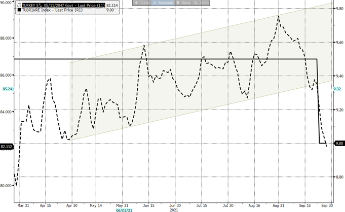
Figure 13 is showing the recent example of an unexpected rate cut by the Turkish Central bank. The selloff in Eurobond Market started immediately.
This is not the type of risk we can expect from US Fed (at least they have no room to decrease the rate).
In the Table 1 all meaningful economic statistics for September 2021 are combined.
Figures, showing inflation risk, can look optimistic for investors – this is the major intrigue for the time being. The point is the inflation is nothing but improving retail demand, durable goods orders, home sales etc. The short-term reaction of investors on that has always been positive. Those number, though, contain an inflationary component. We should pay extreme attention to figures which show not nominal but real situation. These are: PMI, unemployment, and business sentiment indicators. The picture is still mixed; however, the “real” indicators are more often negative. Non-farm payrolls that came out on the third of Septembers, frightened investors. Jobless claims, University of Michigan Sentiment, Markit PMI were negative.
At the same time one can notice that almost all inflation-linked “nominal” figures, were positive: Housing Starts, Durable orders, Mortgage applications, new home sales came out higher than expected.
We are living in a period when even historically positive numbers can contain a toxic inflation pill. Following the economic statistics will not help much, anyway. The market is growing while investors take figures positively. One can hardly predict when the investors’ perception will change, or the Fed’s decision will have a sobering effect. The only way one can save money is a conservative portfolio management approach inline with proper stock allocation (the bond market is toxic in this respect).
| Date | Event | Date | Survey | Actual |
|---|---|---|---|---|
| 2021-09-03 | Change in Nonfarm Payrolls | Aug | 733k | 235k |
| 2021-09-16 | Initial Jobless Claims | 11-Sep | 322k | 332k |
| 2021-09-09 | Initial Jobless Claims | 4-Sep | 335k | 310k |
| 2021-09-02 | Initial Jobless Claims | 28-Aug | 345k | 340k |
| 2021-09-23 | Initial Jobless Claims | 18-Sep | 320k | 351k |
| 2021-09-22 | FOMC Rate Decision (Upper Bound) | 22-Sep | 0.25% | 0.25% |
| 2021-09-14 | CPI MoM | Aug | 0.40% | 0.30% |
| 2021-09-01 | ISM Manufacturing | Aug | 58.5 | 59.9 |
| 2021-09-17 | U. of Mich. Sentiment | Sep P | 72 | 71 |
| 2021-09-16 | Retail Sales Advance MoM | Aug | -0.70% | 0.70% |
| 2021-09-15 | MBA Mortgage Applications | 10-Sep | — | 0.30% |
| 2021-09-08 | MBA Mortgage Applications | 3-Sep | — | -1.90% |
| 2021-09-22 | MBA Mortgage Applications | 17-Sep | — | 4.90% |
| 2021-09-01 | MBA Mortgage Applications | 27-Aug | — | -2.40% |
| 2021-09-27 | Durable Goods Orders | Aug P | 0.70% | 1.80% |
| 2021-09-02 | Durable Goods Orders | Jul F | -0.10% | -0.10% |
| 2021-09-15 | Industrial Production MoM | Aug | 0.50% | 0.40% |
| 2021-09-24 | New Home Sales | Aug | 715k | 740k |
| 2021-09-01 | Markit US Manufacturing PMI | Aug F | 61.2 | 61.1 |
| 2021-09-23 | Markit US Manufacturing PMI | Sep P | 61 | 60.5 |
| 2021-09-21 | Housing Starts | Aug | 1550k | 1615k |
| 2021-09-03 | Unemployment Rate | Aug | 5.20% | 5.20% |
| 2021-09-01 | ADP Employment Change | Aug | 625k | 374k |
| 2021-09-22 | Existing Home Sales | Aug | 5.89m | 5.88m |
| 2021-09-10 | PPI Final Demand MoM | Aug | 0.60% | 0.70% |
| 2021-09-02 | Factory Orders | Jul | 0.30% | 0.40% |
| 2021-09-02 | Trade Balance | Jul | -$70.9b | -$70.1b |
| 2021-09-23 | Leading Index | Aug | 0.70% | 0.90% |
| 2021-09-15 | Empire Manufacturing | Sep | 17.9 | 34.3 |
| 2021-09-10 | Wholesale Inventories MoM | Jul F | 0.60% | 0.60% |
| 2021-09-01 | Construction Spending MoM | Jul | 0.20% | 0.30% |
Tab. 1. US economic statistics as of September 2021 (Bloomberg)
Inflation in Emerging Markets
Emerging Markets are much more vulnerable to the inflation risk, inflation spikes are much more common here. The principles are the same, though, so EM inflation examples are worth studying.
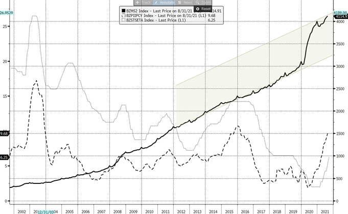
Brazilian M2 increase is the same the US has. CPI has also risen by the same value of ~5%. Ten-year local bond market benchmark yield has grown from 7% to 11% as of the end of September.
Brazil is a commodities net-exporter. The rally in commodity prices is positive for the country’s balance sheet. It can’t help fighting inflation, though: export prices heavily affect the local ones. Falling commodities are also bad: that what happened in 2015. It influences Emerging Markets through a negative trade balance, devaluation of a local currency and hence increasing import prices. The ideal situation for EM is stable commodities. Developed markets do not suffer from that due to diversified economy structure.
Figure 13b shows the Russian case. It has common features with the Brazilian one, but the differences are interesting.
M2 expansion in Russia began two years before the coronavirus due to massive QE in favor of the banking system. That lead to RUB 2bn (2.2% of GDP) liquidity surplus. To avoid turning Russian banks’ reserves into loans, the Central Bank of Russia kept the key rate much higher above the inflation that other EM banks did (compare 13a & 13b). That did not completely help, and the short-lived inflation spike occurred in 2018. In 2020 the coronavirus rescuing monetary package followed. All in all, the cumulative effect of the banks’ nationalization and coronavirus rescue is ~27%, inline with what the US and Brazil have.
It is often considered that the inflation in EM countries is resulted from surge in commodity prices. This is not entirely true: as Fig 13c shows, commodity market has grown significantly over the past 1.5 years indeed, but it is still at quite a low level.
Lowering commodity prices in 2017—2019 allowed countries to print money without the inflation pressure. Once the trend changed, inflation surged, reflecting cumulative M2 increase. Several more examples below just confirm that M2 is an ultimate factor affecting inflation[1]:
| Country | M2 increase for (2020—2021) | Average CPI, 2019 | CPI, Sep 2021 |
|---|---|---|---|
| Indonesia | 0 | 3.0% | 1.6% |
| Canada | +23% | 2.0% | 4.1% |
| Mexico | +7% | 3.9% | 5.6% |
US Historic examples
To everyone’s regret, we do not many historic patterns to rely on.
Figure 14 compares the US inflation rate and stock market dynamics. The nature of inflation was different in 1970-s: it was imported due to the commodity market rally. Oil surged from $1/bl to $20/bl in the beginning of seventies. The US economy was hit not only with high inflation, but with surged costs in electricity generation, transportation, and other sectors.
The US stock market almost fully ignored the second wave of the energy crisis in late seventies (due to Iranian revolution and the Soviet invasion in Afghanistan). Nevertheless, the stocks switched to sustainable growth not earlier than after the inflation rate dropped below 3%.
Equity investors ignored the invasion in Afghanistan in December 1979 because the US economy proved stable enough to absorb high energy prices. Current situation repeats that pattern with investors ignoring the damage the coronavirus has made.
1940-s spike in inflation seems more interesting for current practical application.
US government financed the US participation in the WWII through the selling US Treasury securities. During the war time the US debt increased by $157bn which was comparable to the nominal GDP (~$200bn as of 1943).
The first wave of inflation in 1941—1942 pushed equities down.
In the end of the war Fed started gradual sterilization of monetary surplus. Without military expenses money surplus transformed into demand on goods, which provoked the second wave of CPI surge.
Just as like in 1970-s, the stock market took the second wave much more calmly. But, once again, the equity market turned into a growing mode only in 1949, when the inflation rate went negative.
Looking at these two examples we can assume that the inflation pressure on markets has not yet begun. If the next period of stocks’ growth is only set to be after the inflation calms down, the risk emerges that within the nearest two-three years the equity market will stagnate.
Various types of inflation, commodities, and other markets
So far, we have been discussed CPI – the consumer price index. Besides that, it is interesting to look at PPI – producer price index.
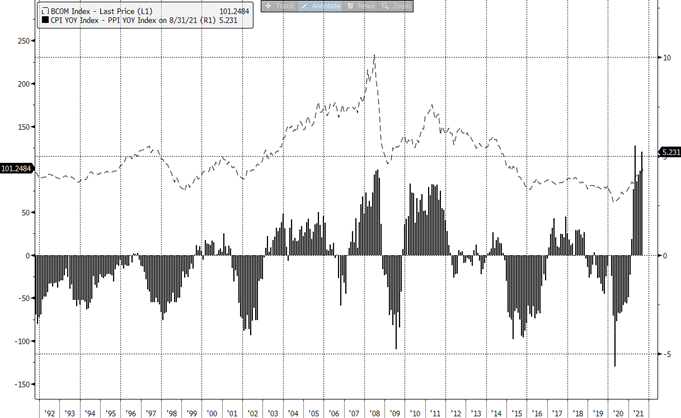
Figure 16 reveals the correlation between (PPI-CPI) difference and commodity prices. The explanation is trivial: surge in commodities ignites surge in infrastructure investments by the mining companies. Rally in commodities in 2021 is caused by numerous infrastructure bottlenecks due to coronavirus restrictions. This situation is temporary. Oil sector seems most vulnerable to the change of perception. It is highly risky to bet on oil given OPEC+ potential production surplus.
What is happening in September 2021 resembles the events from 2008 when the commodity market hit record. Gas supply shortages, quadrupled EU electricity prices (because of the lack of gas), rallying metals (because of demand from the side of real estate developers) – all those paints quite a dramatic picture. Along with that some commodities have already started sliding down after reaching historically near-record levels: iron ore and soybeans are examples.
After explicit panic rally pattern, it would be too dangerous to play long in commodities.
Another interesting sector is consumers. As it has been stated above, a rational investor would be conservative now. Going conservative means buying traditionally defensive stocks: utilities and commodities.
There is no evident correlation between utilities and inflation. Fundamentally, in the long run utilities beat inflation. However, with leading PPI, utilities can stick between enhanced infrastructure expenses, expensive commodities (such as gas for the electricity generation) and lagging CPI, from another side.
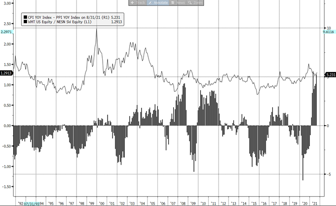
In consumers’ universe those not exposed to high commodity prices are preferable. Figure 17 displays the ratio of Walmart to Nestle stocks on the back of (PPI-CPI) difference. Producers such as Nestle, or Danone are suffering from rocketed commodities. Therefore, investors prefer Walmart (or other companies of that kind) over Nestle and other producers.
Besides, the major feature of consumer companies is their business’ stability. In case of an inflation shock stocks of consumers can be most resilient to the market turbulence.
Although, sector allocation and the total risk appetite are much more important in current situation than stock picking within consumer sector.
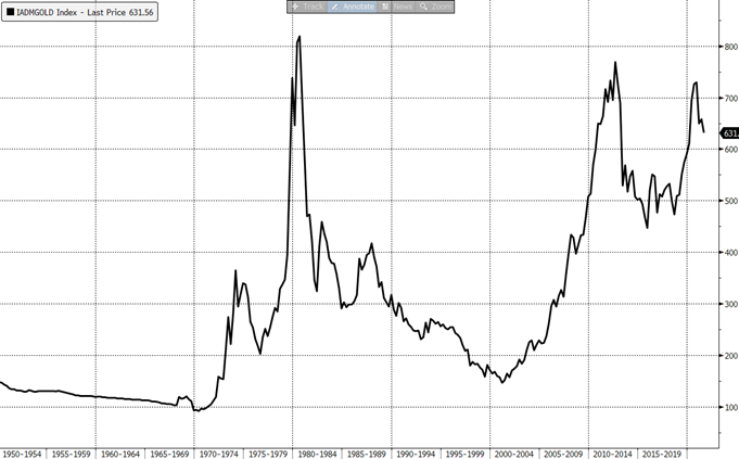
Investing in gold in current situation does not look reasonable. It is the fact that gold is taken by many as an inflation-protecting instrument. Figure 18, though, reveals that the inflation corrected gold price is near its historical top with signs of turning downwards. The gold price surged in 2020, and the game here seems over.
Summary
Inflation risk, emerged after coronavirus rescuing packages, is persisting. Like any other idea inflation fears are cyclical: investors’ moods change, often for technical reasons.
Even without a significant spike of inflation in future, investors can price inflation fears once again, like it was in Q1 2021.
US Historic examples and EM historic patterns reveal that the inflation rate correlates with M2 increase well. This would result in increasing rates, which has always been negative for markets.
Even if Fed (and ither Central banks) manages inflation, it cannot be done without winding down monetary stimuli, which historically also leads to market turbulences.
Bond market is the worst place to be in this situation. Local bonds are worse than international ones because of high sensitivity of local currencies to anything happening in the market.
Almost all instruments traditionally linked to inflation are already quite expensive: mining companies’ stocks and commodities themselves, including gold. Commodities can become a trap when CPI starts catching up with CPI.
Utilities and consumers are good investment targets. In the long run they reallocate inflationary trends on customers. Even without that these stocks are historically quite stable and may be treated as safe havens by investors in case of the fear of inflation materializes.
[1] M2 increase is measured through the trend channel method, like it was done on Figures 13a, 13b.