Is the US Labor market strong or weak? The answer depends on what figures one looks at. A year ago, the US labor market entered a very controversial phase. On the one hand, US Payrolls data has sustainably demonstrated the strength of employment. On the other hand, the Unemployment Rate has grown almost one percent over the same period. In this brief review we share our view on the matter.
Two Labor Market surveys of the Bureau of Labor Statistics
The US Bureau of Labor Statistics (BLS) historically conducts two surveys of the US Labor Market:
· Current Population Survey (CPS), from which we know the Unemployment rate, breakdown of the labor market by gender, occupation, class of worker etc. Also, it provides data on multiple and part-time jobs.
· Current Employment Statistics survey (CES), the core of which is payrolls data.
Figure 1
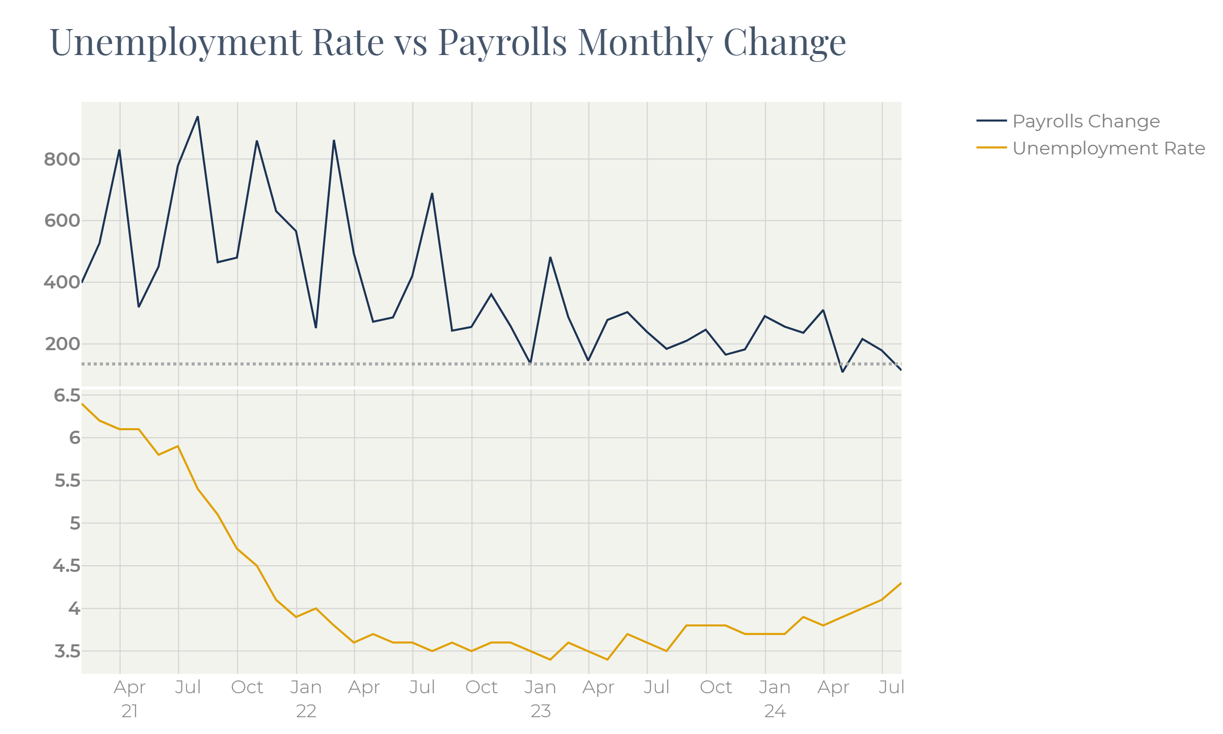
Figure 1 demonstrates this phenomenon. For the unemployment rate to remain steady the US economy should generate circa 135’000 new jobs per month. The payroll data (Figure 1) shows that new job contracts additions have steadily been above the neutral level except April (108k job contracts) and the recent July reading of 114k.
Despite strong jobs creations unemployment has grown over the same period.
The neutral level of 135’000 jobs comes from the following logic:
the labor force in US stands at roughly 50% of the total population:
~80% is the share of those elder than 16 years and younger than 65,
~62% of which are working people (labor participation rate).
The population growth in the US is close to 1% per annum. It means that in equilibrium the US labor market should add roughly 1.6 million new jobs per year, or roughly 135k of jobs in monthly terms.
None of these surveys gives a full picture of the employment landscape. For better understanding the labor market trends, we need to look closer at both surveys.
The two surveys do not lead to one figure even theoretically. For example, one person working at three jobs will add “1” to the household survey and “3” to the establishment one. By contrast, a self-employed individual will add “1” to the household data but will not be seen by firms and will add nothing to the payroll data. More detailed comparison of the two methods can be found on the BLS website:
https://www.bls.gov/web/empsit/ces_cps_trends.htm
The BLS also publishes the adjusted household employment series which is meant to replicate payrolls. Generally it is very close to the payrolls series, but by now these two lines have ddiverged:
Figure 2
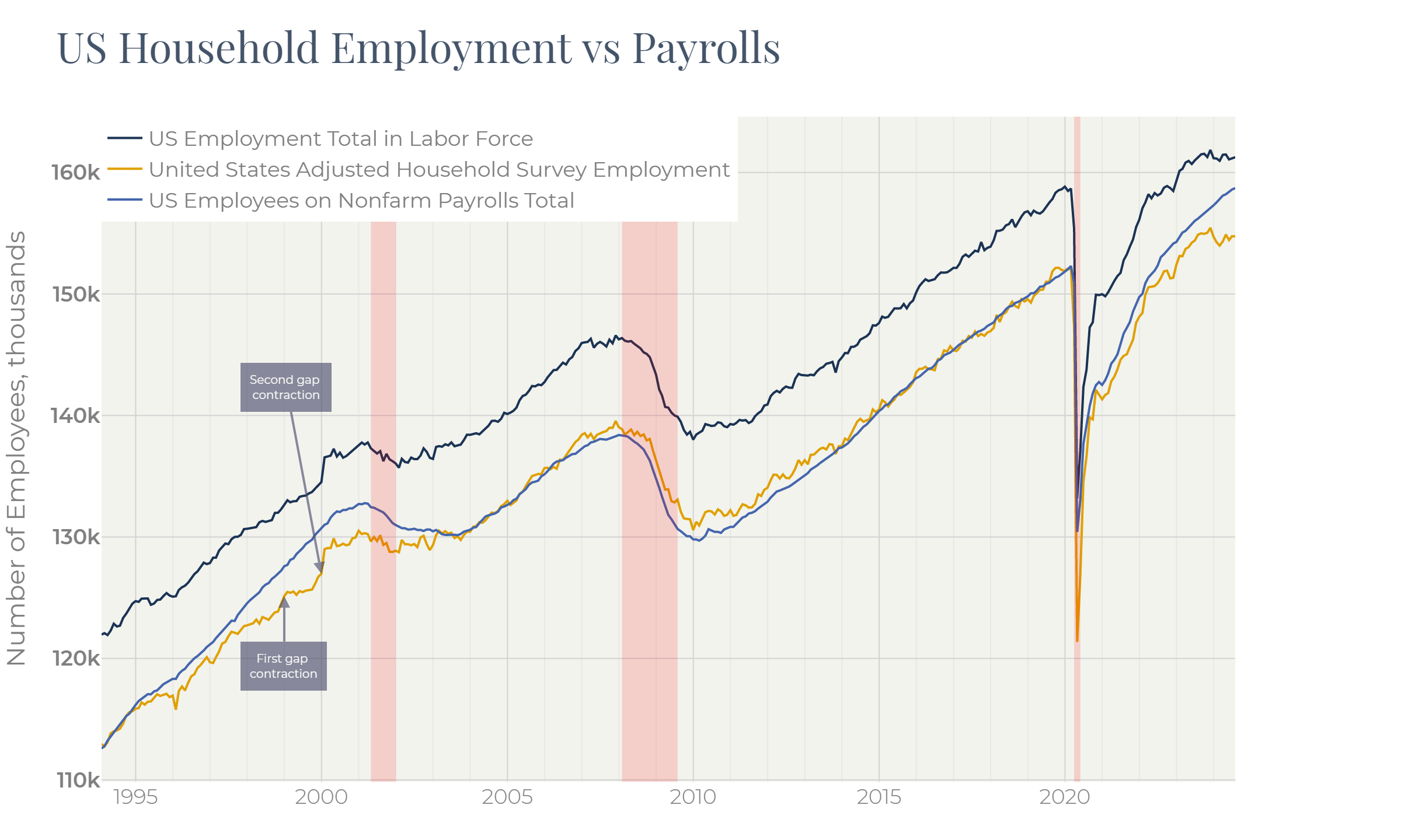
We can also note from the Figure 2 that at least once, in the late 1990s, there was a similar divergence.
Figure 3
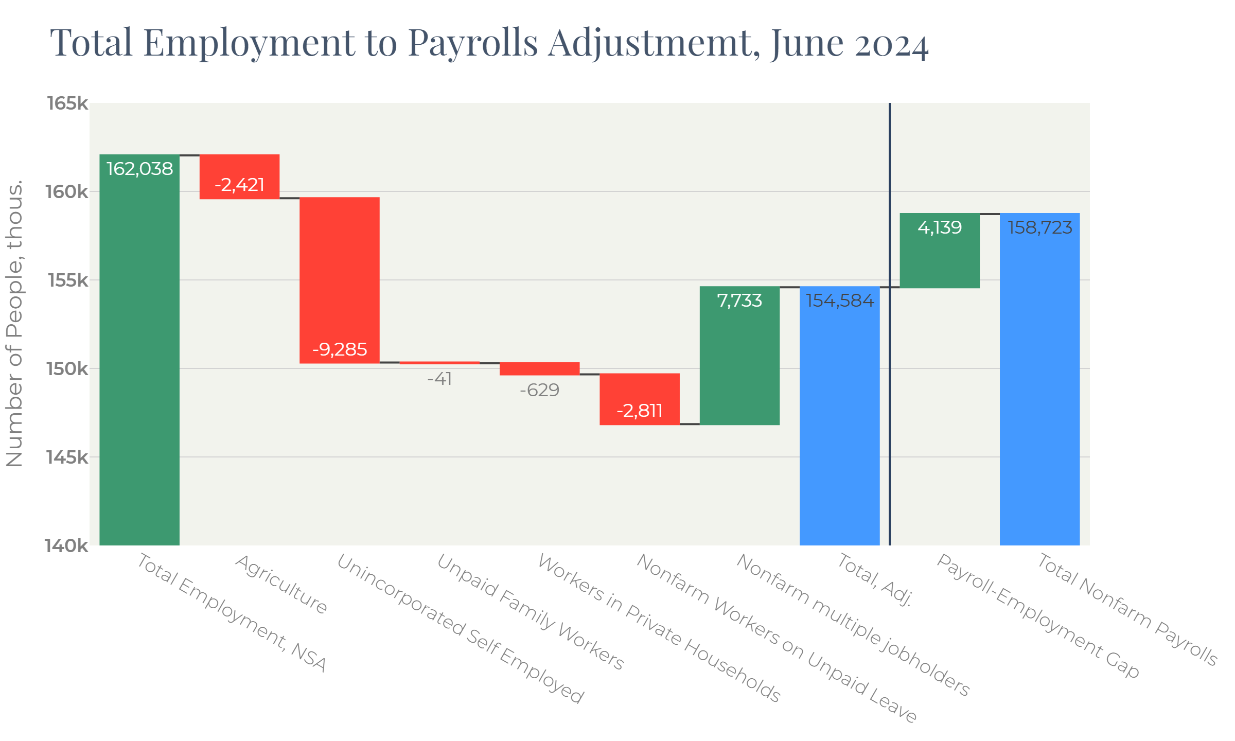
Figure 3 sheds light on the adjustment algorithm of the BLS. Two major contributors to the difference between households and establishments employment are:
· Self-employed individuals,
· Multi-jobbers.
Self-employed cannot be a reason for the 4 million “employment-payrolls” gap. If workers do not identify themselves as self-employed (off-book jobs), they do not present in both sets of data. If they do, they are made up for by the adjustment algorithm.
The gap between the two approaches can be also affected by the off-book jobs in cases where individuals treat themselves as employees, but they are invisible in the establishment survey getting the under-the-table cash instead of salary.
This assumption is very difficult to verify due to the lack of information. However, we do not think that it has a material impact.
First, it does not seem likely that workers getting cash salaries and thus committing criminal offences intend to disclose themselves in the household survey.
Theoretically, we can model the situation where there are 20 million people getting off-book cash salaries and reporting themselves as employed in the household survey. In this case the total employment in the US stands at ~180 million jobs with the off-book workers representing about 11% of the total workforce.
We expect that 4 million new jobs, having been created since 2022 are evenly distributed across the labor market. This would have increased both household employment and payrolls, with the gap between them expanding only marginally by 11% of the total 4 million increase.
The real situation looks like all 4 million vacancies were occupied by the off-book workers which decided to come to light. This looks very artificial.
Considering multiple jobs, though, makes the picture more consistent.
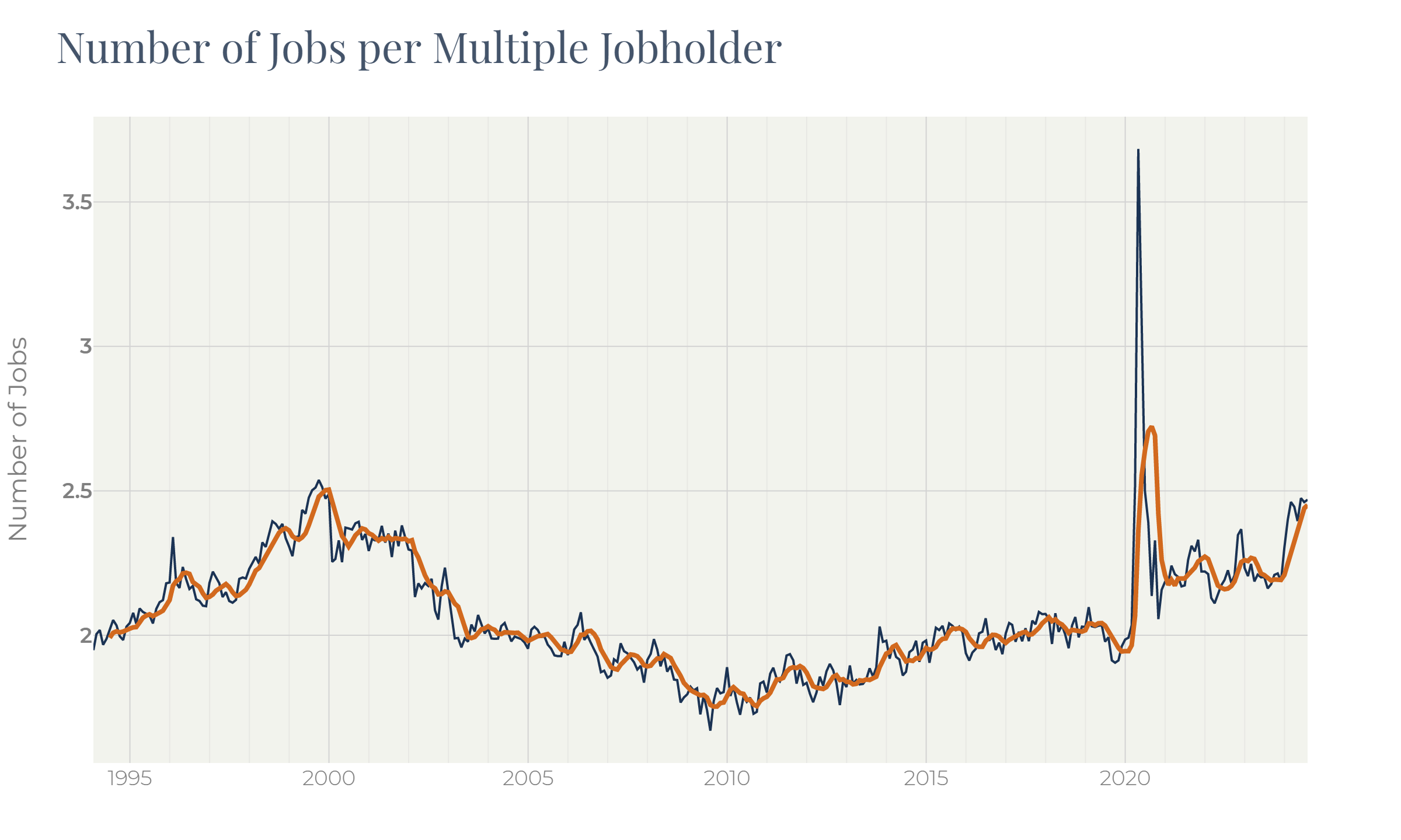
The BLS adjustment algorithm just adds the multiple jobholders’ number to the household survey gauge (Figure 3) implying between lines that each multiple jobs holder has exactly two jobs.
In reality it is not so. We can assume that the gap between the two BLS employment measures is entirely caused by multi-jobbers. Based on this, we can estimate the number of jobs per one multi-jobber on average:
Figure 4
Let us take a closer look now at what was going on in the labor market in the late 1990s when a similar gap between the two employment measures existed:
Figure 5
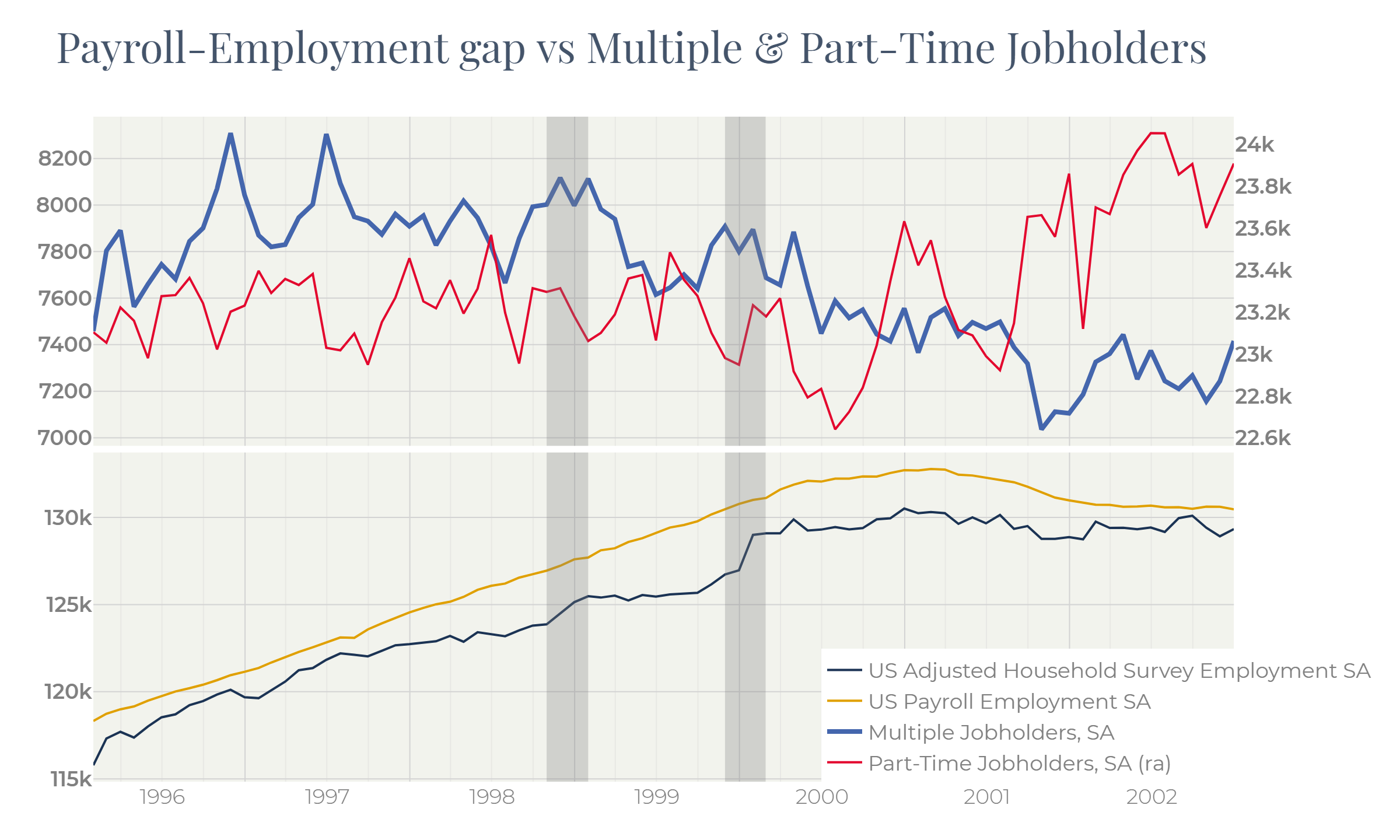
The household employment data lagged payrolls in 1998, 1999 and 2000. Twice – in December 1998 and in January 2000 the gap between two gauges narrowed through the household employment spikes.
In H2 2000, by contrast, it was payrolls that dropped and narrowed the gap.
The question is: what stage are we now at, in 2024?
In all cases except 2000 the employment gap expansion followed spikes in multiple jobs. In 2000, by contrast, the payrolls advanced household employment on the back of falling multiple jobs and part-time jobs. In 2000 newly created part-time jobs failed to become full-time and therefore did not lead to involving new workers.
Figure 6
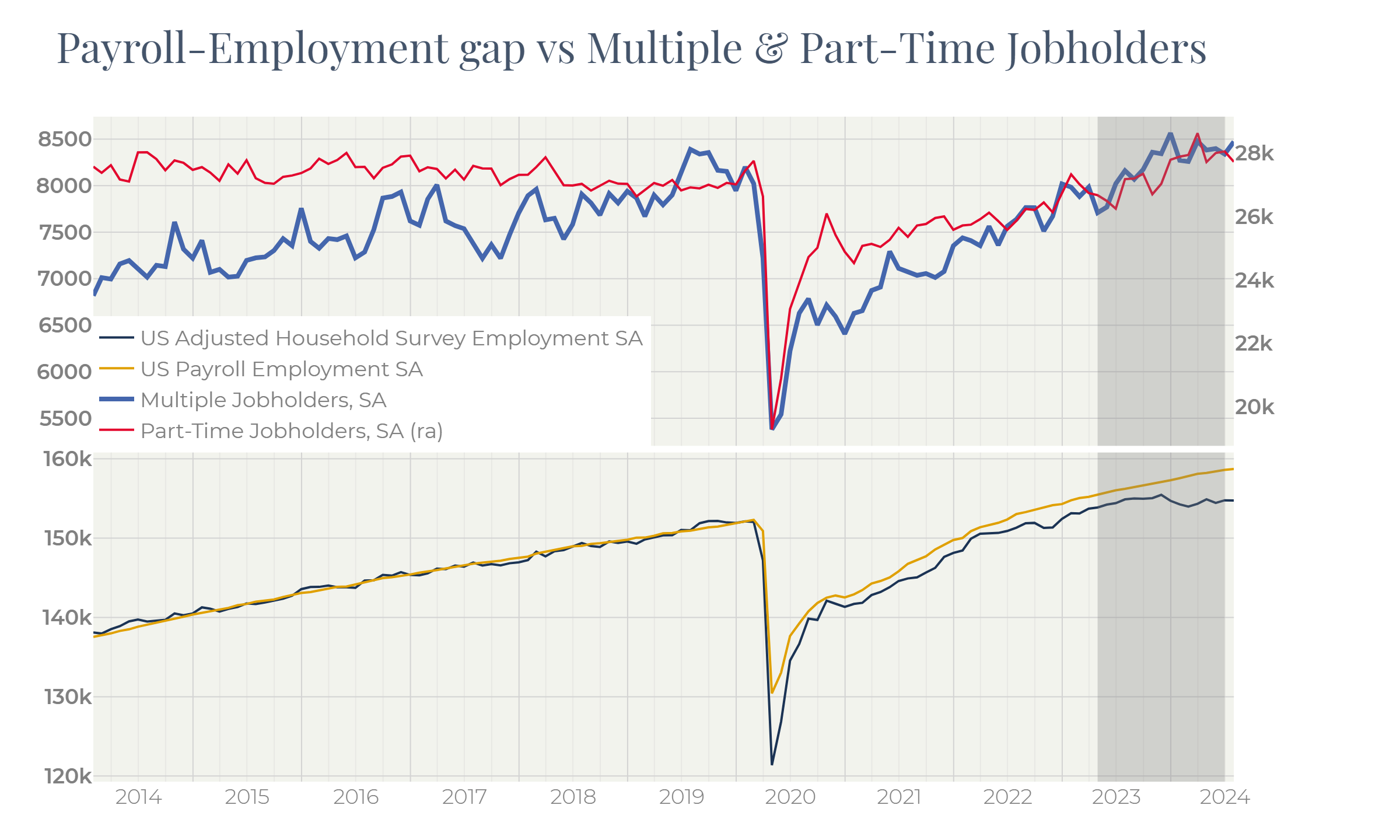
From the figures above we can see that the employment survey (payrolls) is slower and lagging.
In expansion cycles the economy often starts generating part-time jobs occupied by multi-jobbers. Then these positions turn into full-time involving more workforce. Then overtime hours rise. All these transformations do not affect payrolls.
For better understanding the labor market we need to consider other factors. The household survey is a main source of such data, however, it is noisy, albeit faster.
One of the factors that needs to be considered for smoothing this noise, is overtime hours:
Figure 7

This is the first thing employers cut in contraction cycles.
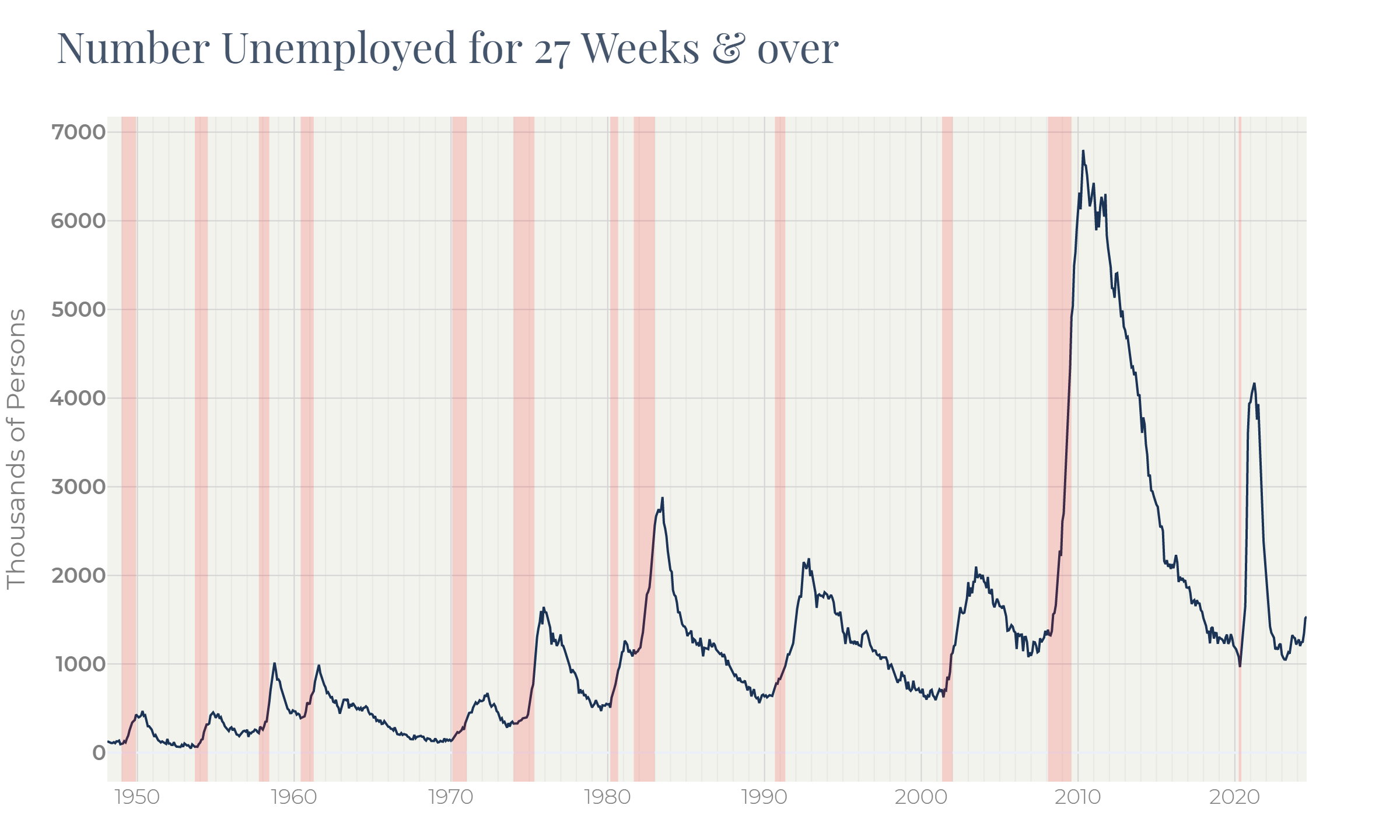
The number of unemployed for more than half-year which is part of the CPS survey also adds colors to the labor market picture:
Figure 8
Another useful indicator is the Nonfarm Job Openings also released by the BLS:
Figure 9
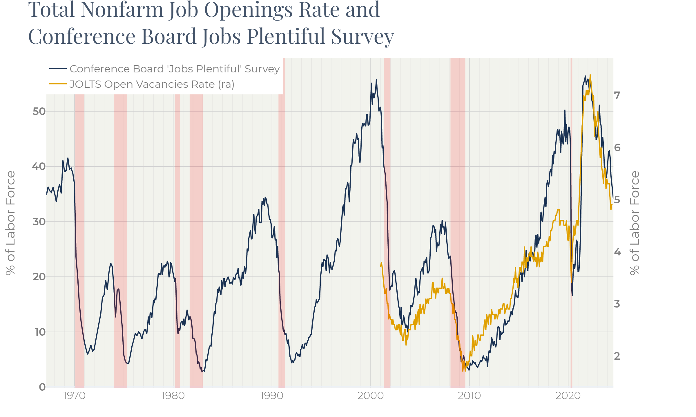
This indicator has only existed since 2000. However, the Conference Board publishes the consumer confidence survey that contains a well-correlated series based on the question “Jobs Plentiful to find”. It allows us to look deeper into the vacancies’ history.
We can see that all these indicators were in the positive mood before 2000, but all of them changed their behavior in 2000 and sent warning signals.
Figure 10
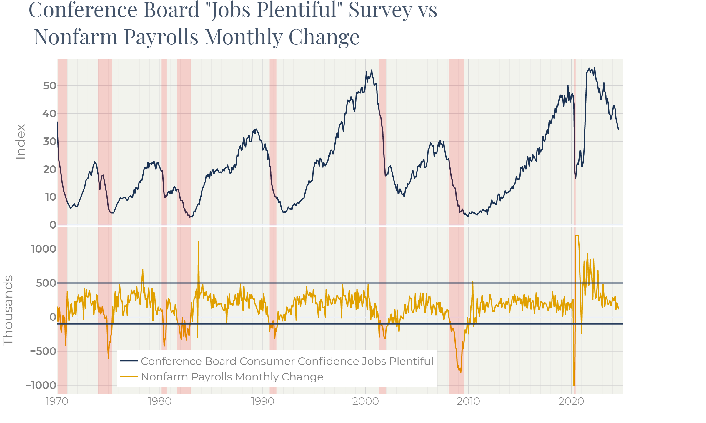
Figure 10 demonstrates the lagging character of the payrolls data compared to the Conference Board’s “Jobs Plentiful” survey.
Payrolls tend to be very stable in their historical range 100—200k, even after warning signals from other figures. Sinking under (-50k) often corresponds to recessions’ starts. In 1990, 2000, 2008, payrolls plummeted with significant delays to other figures. This feature of the establishment survey does not allow us to rely on it for predicting markets: it only falls when markets crash.
By now the situation in the labor market has been deteriorating since 2022. Investors first got scared but then relaxed because a recession did not happen. The labor market also looks super-resilient: we cannot find historical episodes where two-year slump in vacancies and overtime did not lead to recessions.
We suppose, however, that Figure 9 provides a simple explanation for this fact. Job openings, albeit having been falling for two years, have long remained at incredibly high levels, not allowing unemployment to grow.
However, each percentage point of falling job vacancies makes the labor market more fragile. The risk that something cracks at last is increasing. Perhaps, this is what the Fed Chair Powell meant saying that the labor market can bring negative surprises going forward.
Summary
The US labor market has long been strong despite the high-rate environment. Indicators describing the labor market, though, have provided controversial signals since a year ago. We concluded that the establishments’ payroll data is slower than the other gauges and often draws a more optimistic picture that cannot be taken as a proof of the labor market resilience.